10 Years of UX/UI Design: Lessons Learned & the Future of UX
- Neuron

- 6 hours ago
- 15 min read
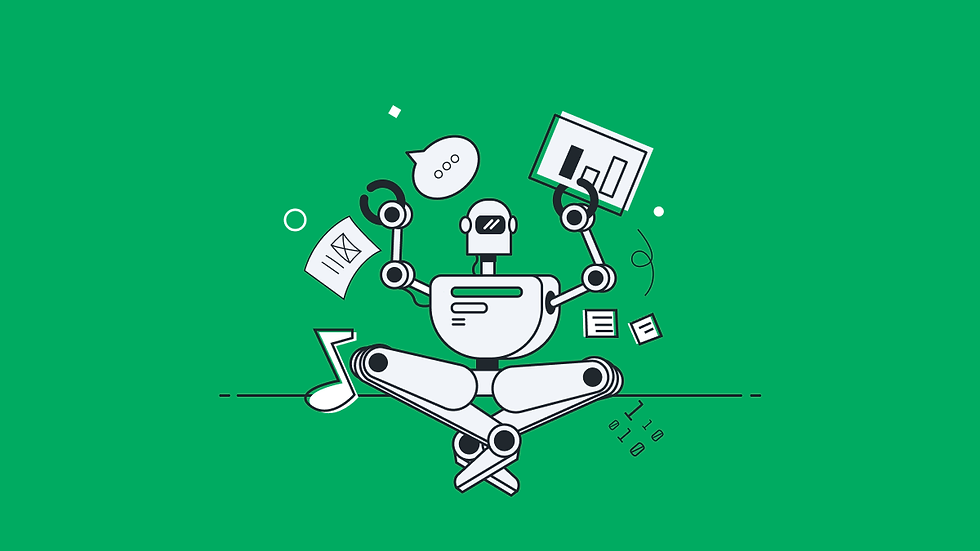
We’re celebrating 10 years of UX/UI design and exploring the trends, technologies, and lessons that transformed digital products over the last decade.
A lot can happen in 10 years. Entire product categories emerge and disappear. Design trends rise and fade. Tools that once defined the workflow become obsolete. In that kind of environment, a decade offers something rare: perspective.
Reaching our 10-year milestone offers a rare opportunity to zoom out and reflect on how the industry has evolved. Over the past decade, user experience design has matured from trend-driven interfaces to experiences that require deeper systems thinking. From mobile-first debates to AI-augmented products. From startup velocity to enterprise-scale complexity. At the same time, our own focus sharpened alongside the industry, moving deeper into complex enterprise platforms, product strategy, and the operational realities of scaling design inside organizations.
The goal of this article is to reflect on both arcs on how the industry changed. How our positioning evolved in response. What patterns consistently separate effective products from forgettable ones. And most importantly, what the next phase of UX/UI design will demand from teams building the systems that businesses and users now rely on every day.
The industry shift

The evolution of UX design tools
The most telling signal of change is the tool we were using 10 years ago versus today. The past decade reshaped the design stack in clear stages:
From Adobe Illustrator and Photoshop (PSD): static, visual-first files built for handoff
To Sketch: the UI-first era, introducing components and system thinking
The inbetweens: XD, Zeplin, UX Pin
To Figma: real-time, browser-based collaboration across distributed teams
And now toward AI-assisted workflows that lightly accelerate exploration and iteration
Along the way, static mockups became interactive prototypes. Redlines became living design systems. The canvas stopped being a deliverable and became a collaborative environment.
The biggest shift through tools was operational efficiency, which we refer to at Neuron as DesognOps. Tools transformed speed and teamwork, but clarity, hierarchy, and strong workflow thinking remain the foundation of great UX.
The end of web 2.0
The late 2000s into the 2010s marked a major shift in how people interacted with the internet and what they expected from UX design. This wasn’t just about better interfaces. It expanded who the internet was for and how it functioned at scale.
User-generated content turned passive audiences into active participants. Anyone could publish, share, or contribute, whether through blogs, videos, or collaborative platforms like wikis. We saw firsthand how massive knowledge bases could be built and maintained by users, as long as the experience was simple and intuitive. Often, that meant reducing complexity down to something as straightforward as an “Edit” button. That level of accessibility set a new standard for design.
At the same time, social platforms introduced entirely new behavioral patterns. Infinite scrolling, real-time feedback loops, and social validation mechanics like likes and shares became core UX considerations. These features acted as engagement engines, requiring a deeper understanding of user psychology alongside usability.
Our work during this period sat directly within this shift. Projects like Projects for Good and YouRip placed us inside the early creator economy, before it became a widely recognized category. Projects for Good reflected the rise of gamification, a trend that was often overused or poorly implemented. Our approach focused on aligning incentives with meaningful user actions, making sure engagement mechanics added value instead of distraction.
The rapid adoption of smartphones also forced a rethinking of digital experiences. UX/UI had to be responsive, adaptable, and immediate. Interactions became more fluid, powered by advances in JavaScript, while visual design borrowed from operating systems with glossy buttons, drop shadows, and tactile cues that helped users navigate digital spaces more intuitively.
This era also marked the beginning of broader awareness around the trade-offs of “free” platforms. As data became the underlying currency, early conversations around decentralization started to emerge, signaling a shift in how users thought about ownership and trust online.
From consumer to system complexity
As digital products matured through the late 2010’s, UX entered a phase defined less by growth and more by complexity. This was the point where designing for consumers evolved into designing for systems. Interfaces were no longer single-purpose or lightweight. They needed to support layered workflows, large data sets, and multiple types of users operating within the same environment.
To manage this, more structured UX patterns became essential:
Progressive disclosure helped keep interfaces approachable by revealing complexity only when needed. Simple views for new users, with deeper functionality accessible through expandable sections or advanced settings.
Role-based experiences ensured relevance. Interfaces were adapted based on permissions, so each user only saw the tools and data necessary for their role.
Component-based design systems emerged, replacing one-off screens with reusable patterns and libraries like Bootstrap to ensure consistency across growing products.
At the same time, visual design underwent a major shift. Skeuomorphic interfaces gave way to flat design, heavily influenced by Google’s release of Material Design in 2014. While this brought a cleaner, more modern aesthetic, it also introduced new usability pitfalls. In many cases, teams overcorrected. Buttons lost their visual affordances, becoming indistinguishable from plain text. Users were left guessing what was interactive. Similarly, mobile-first thinking led some enterprise tools to hide complex navigation behind hamburger menus, even when users depended on constant visibility across dozens of sections.
Our work on Rutter is a strong example of how we approached this era. This was not a typical application. It was a mission-critical system used to help mariners navigate icebergs, respond to oil spills, and manage fleets in real time. The complexity was not optional; it was inherent.

We were responsible for redesigning the entire product suite, focusing on usability, extensibility, and a more cohesive interaction model. That meant rethinking the information architecture to support a wide range of users, from on-vessel captains to shore-side operators, researchers, and port authorities. Each had distinct needs, but all relied on the same underlying system.
We also had to design for environments most teams never consider. These interfaces weren’t used at desks. They were used on marine-grade displays in unstable conditions, often in high-pressure scenarios such as navigating ice fields at night. Every interaction had to be clear, reliable, and fast.
This is where UX/UI fully shifted from surface-level design to systems thinking. It was no longer about how something looked. It was about whether it worked when it mattered most.
The Web3 experiment
What once felt like a fever dream in 2020 was the next ‘wave of innovation’ with a bold promise: a more open, user-owned internet. Web3 pushed the idea of decentralization into the mainstream, but in practice, it introduced a new layer of complexity that most users weren’t prepared for.
At the same time, machine learning and data systems were quietly making digital experiences smarter and more personalized. Interfaces became more responsive to behavior, surfacing the right content at the right time. In Web2, much of this complexity was hidden. In Web3, it was exposed.
That shift created a very different kind of UX challenge. Instead of abstracting complexity away, many early products required users to engage with it directly. The friction was immediate and often intimidating:
Managing wallets, private keys, and irreversible transactions
Navigating gas fees and unpredictable costs
Safeguarding 12–24 word seed phrases with no fallback
Interacting with unfamiliar concepts layered into everyday actions
For many, this was their first experience with true digital ownership, and it came with real consequences.
The products that gained traction weren’t necessarily the most advanced. They were the ones who made these interactions feel familiar. Reducing friction, guiding users through risk, and borrowing patterns from Web2 became critical to adoption. It was a reminder that no matter how powerful the technology is, usability is what determines whether people actually use it.
Our work during this period, including projects like Geojam and ICO Mint, placed us directly inside this experimentation phase. Geojam in particular required us to bring together multiple complex systems into a single, cohesive experience. Social engagement, token-based economies, digital ownership, and access-based experiences all had to work together without overwhelming the user.

Designing for this meant more than simplifying interfaces. It required bridging entirely different mental models, helping users understand what was happening without forcing them to think like engineers. This era made one thing clear. When complexity becomes visible, UX becomes the difference between curiosity and adoption.
DesignOps takes center stage
This was the era when UX grew up. It moved from being a sub-service of the Product Team to something much closer to business-critical infrastructure. The conversation shifted from “how does this look?” to “how does this scale?” and “how do teams actually work together to build this?”
A big part of that shift was operational. As products and teams expanded, design needed structure to keep up. What we saw across organizations was a move toward more intentional systems, workflows, and governance to support design at scale.
A few patterns defined this transition:
Design systems became living products
What were once static UI kits evolved into systems connected to code. They weren’t just references; they were the foundation teams built on. This brought consistency, but more importantly, it enabled speed without sacrificing quality.
Design tokens changed how updates happened
The introduction of tokens into tools like Figma made global updates significantly easier. Changes that used to take days, like adjusting typography or component styles across a product suite, could now happen almost instantly.
Collaboration became real-time (and very visible)
Multiplayer design fundamentally changed workflows. Working in a file with multiple designers, stakeholders, or clients became the norm. It accelerated feedback, but also introduced a new level of pressure. Design was no longer a polished deliverable; it was something people watched happen live.
Systems thinking…sometimes went too far
Again, in some cases, teams overcorrected. Everything became a component, whether it needed to be or not. Simple solutions turned into complex, over-engineered systems that slowed teams down instead of enabling them.
Stakeholder input expanded, and so did friction
As UX gained influence, more voices entered the process. Feedback loops grew, and decision-making sometimes suffered. We saw firsthand how “design by consensus” could dilute strong ideas into something safe but far less effective.
Our work during this period, including engagements with HMH, Uniphore, and LegitScript, focused on helping teams navigate this complexity without losing momentum.
With Houghton Mifflin Harcourt, we stepped into an ecosystem shaped by years of growth and acquisition. Multiple platforms and parallel design systems had created fragmentation across both product and process. Our role was to bring alignment without slowing teams down.

We established a unified DesignOps approach that connected systems, standardized workflows, and created a shared foundation for teams to build on. Just as importantly, we ensured it was flexible enough to support different products and use cases. The result was a more cohesive experience and a measurable improvement in how teams collaborated and delivered.
This was the moment UX stopped being just about design. It became about how design operates.
AI enters the UX chat
AI didn’t just enter the UX conversation; it reshaped the interface. The humble search bar evolved into something far more powerful: a universal entry point where users don’t navigate, they ask.
One of the earliest breakthroughs wasn’t just capability, but feeling. The streaming response changed expectations almost overnight. It reduced perceived latency and gave the impression of real-time thinking, making the experience feel more alive.
At the same time, the rush to adopt AI introduced some uneven patterns. We saw a mix of innovation and overcorrection:
Artificial latency designed to make systems feel “human”
Over-automated support that confidently gave incorrect answers
The “sparkle button” explosion is often added without a clear purpose
Summary overload, especially in B2B tools, where clarity got lost in layers of abstraction
As the space matured, one theme became clear: trust. Users needed to understand not just the answer, but how it was generated. Patterns like citations, source panels, and visible system steps (e.g., “searching,” “analyzing,” “comparing”) became essential for credibility.
At the same time, AI began changing how products are built. Tools like v0 and Cursor started generating functional UI from a single prompt, reducing the need for manual wireframing and shifting the role of the designer toward systems, prompts, and outcomes.
Our work with a leading research and strategic consulting firm (still a WIP, so can’t disclose who just yet 😉) reflects this shift. Their platform delivers dense, data-rich insights, but finding and making sense of that data needs to be faster and more intuitive than ever before.
We redesigned search as the core experience, introducing a vector-based system that better understands intent and surfaces more relevant results. On top of that, we designed an omnipresent AI assistant that helps users refine queries, explore results, and start new lines of research, all grounded in cited data to maintain trust.
This approach allowed users to move from searching for answers to collaborating with the system itself. This is where UX is heading, shaping how people interact with intelligence.
How Neuron evolved alongside the industry
The past decade reshaped how digital products are designed, built, and scaled. As those shifts unfolded, Neuron evolved alongside them. The changes inside the company were less about growth and more about responding to where design was becoming most critical.
What began as a boutique studio solving a wide range of creative problems gradually sharpened into a practice focused on complex product experiences. As organizations scaled and products grew more sophisticated, the role UX played in shaping those systems expanded as well.
From a Seattle studio to a San Francisco-based global collaboration
Neuron began as a small design studio in Seattle, founded by four college friends from Boston and their mentor, Soudy Khan, with the belief that thoughtful design could meaningfully improve how people interact with technology. In the early years, the team was small, and the work varied widely, spanning branding, digital design, product interfaces, and development.

As the company grew, the center of gravity moved to San Francisco, placing the team closer to a rapidly evolving product ecosystem. The work increasingly focused on SaaS products and emerging platforms, navigating usability, scale, and complex workflows.
Over time, the way design teams collaborate has changed across the industry. Tools moved into the browser, and distributed work became normal. Neuron gradually evolved into a globally distributed team, collaborating across time zones with both talent and clients around the world.
From generalist to deep product design expertise
In its early years, Neuron operated as a broad creative partner. Projects ranged from branding and marketing sites to interface design and product work–fitting in however clients needed.
Little by little, a clear pattern emerged. The most difficult challenges clients faced were not primarily visual but structural. As digital products matured, especially in B2B environments, complexity increased. Workflows grew deeper, interfaces carried more data, and systems had to support multiple roles across organizations. Rather than expanding services further, Neuron narrowed its focus toward user experience for complex products where clarity and workflow thinking have the greatest impact.
From startups to enterprise organizations
Many early projects centered around startups building new products quickly. Rapid MVP cycles and fast iteration defined much of the work.
As those companies grew and as Neuron began partnering with larger organizations, the challenges evolved. Enterprise environments introduced new considerations such as scale, governance, compliance, and internal alignment.
UX decisions began influencing far more than individual screens. They affected workflows, team efficiency, and product adoption across entire organizations. The work increasingly moved from short sprint engagements to longer initiatives focused on improving systems at scale.
From execution to product strategy influence
Early engagements often focused on execution. Teams needed help designing interfaces, refining usability, and shipping polished experiences.
Gradually, the role of UX expanded upstream. Design conversations began earlier in the product lifecycle and influenced larger decisions around product direction, user workflows, and feature prioritization.
Today, UX contributes not only to how products look and function but also to their success in the market. By working closely with product and engineering stakeholders, design helps shape roadmaps, improve adoption, and ensure complex platforms remain usable as they grow.
The enterprise UX reality
Enterprise products are often the backbone of organizations, but their UX challenges are unique. Unlike consumer apps, they operate at scale, serve multiple roles, and manage complex workflows. The teams that succeed are those that recognize UX as strategic infrastructure rather than optional polish.
The most common challenges we see
Across industries, enterprise products tend to struggle with similar issues:
Complex, data-heavy interfaces that overwhelm users
Internal tools are treated as secondary to customer-facing apps
Lack of a consistent design system, leading to inconsistency and inefficiency
Siloed teams, with tribal knowledge, are slowing product velocity
Feature growth outpacing usability
Even small improvements in these areas can dramatically reduce friction, increase adoption, and support operational efficiency. For example, streamlining a multi-role dashboard or standardizing component libraries can improve both speed and satisfaction across large teams.
The strategic shifts that made the difference
In our work, the most effective interventions focus on creating clarity, consistency, and alignment:
Prioritizing workflow clarity over feature expansion
Establishing scalable design systems that maintain consistency as products grow
Embedding UX research into decision-making, not just interface tweaks
Aligning design with measurable business outcomes, ensuring ROI
Treating UX as infrastructure that enables work rather than decoration
These shifts transform enterprise UX from a cost center to a strategic advantage. In several cases, small investments in workflow clarity and systematized design have improved adoption, reduced support load, and created lasting trust among users.
What 10 years of UX design taught us
A decade of working inside complex digital products reveals patterns that repeat across industries. The tools change. Technology evolves. But the factors that determine whether a product remains usable, scalable, and valuable tend to stay surprisingly consistent.
Across startups and global enterprises, the products that last are rarely defined by visual trends or feature volume. They succeed because they are built around a clear strategy, operational alignment, and a focus on meaningful impact.
Looking back over the past 10 years, four priorities consistently distinguish products that age well from those that struggle to keep up.

1. Strategy over surface design
Visual design often receives the most attention, but durable products are rarely defined by their appearance. They are defined by how clearly they solve problems.
Strong UX begins with product strategy and SPARK. Understanding user workflows, defining the right problems to solve, and structuring systems around real behaviors creates far more value than aesthetic refinement alone.
The strongest products consistently prioritize:
Clear workflows over visual novelty
User outcomes over feature volume
Product clarity over aesthetic experimentation
When strategy is clear, design amplifies it. When it is not, even the most polished interface struggles to hold up over time.
2. Design operations are as important as design
Many usability challenges are not design problems at all. They are operational ones.
How a product is managed, updated, and maintained directly impacts the experience it delivers. Organizations that succeed tend to align design, product, and engineering around shared systems that allow products to evolve without accumulating friction.
That often includes:
Design systems that create consistency and speed
Clear ownership across design, product, and engineering
Governance that prevents fragmentation as teams grow
UX maturity in DesignOps often requires a shift in mindset. It is not just about improving interfaces. It is about improving how products are built and sustained.
3. Ignore the noise, ship what matters
Digital products exist in an environment full of noise. New technologies, frameworks, and design trends constantly compete for attention. Teams can easily spend weeks debating minor interface details while larger usability challenges remain unresolved.
The most effective teams resist that pull. Instead of chasing trends, they focus on the changes that materially improve how users work. Reducing friction in key workflows almost always creates more value than adding new surface-level features.
4. From insights to action (closing the loop)
Many products surface data but stop at insight. Dashboards, reports, and analytics can help users understand what is happening, but they often leave the next step undefined.
The products that become truly valuable go further. They connect intelligence directly to action. Instead of simply showing information, they allow users to make decisions, trigger workflows, and solve problems in the same environment.
This shift also creates a powerful competitive advantage. When a tool becomes part of how work actually gets done, it becomes far harder to replace.
Products that achieve this tend to:
Connect insight directly to workflows and decisions
Support multiple use cases within a single environment
Reduce the need for users to switch between tools
Eventually, the product stops being a place users visit for information and becomes a system they rely on to operate. That level of integration is what creates real stickiness and long-term differentiation.
Where UX goes from here
The next phase of UX will not be defined by trends alone. It will be shaped by how well products adapt to increasing complexity, evolving user expectations, and the growing role of software in how businesses operate and scale.
While new technologies will continue to emerge, the real shift is in how products behave, how teams build them, and how deeply UX influences organizational outcomes.
AI-augmented products
AI is moving beyond a novel feature and becoming a core layer of modern products. Interfaces are starting to feel less like tools and more like collaborators.
Interfaces are becoming more conversational and predictive
Systems surfacing the right information at the right time
Designers shaping behavior and decision-making, not just layout
But with that shift comes responsibility. AI-driven experiences must be transparent, trustworthy, and controllable via a Human-in-the-Loop (HITL) approach. The challenge is not just adding intelligence, but applying it in ways that genuinely improve outcomes.
The products that succeed will use AI to create clarity and momentum, not noise.
The rise of adaptive systems
Products are becoming more responsive to context, behavior, and real-world usage. Static interfaces are giving way to systems that adjust based on user needs.
This shift is especially visible in B2B environments:
Increasing personalization based on role, data, and workflow
Blending automation with human oversight
Moving from passive dashboards to actionable systems
Instead of simply presenting information, products are beginning to guide users toward decisions and next steps. The goal is not just awareness, but action within the flow of work.
UX as organizational leverage
User experience is expanding beyond the product itself and into how organizations operate.
Design influences product structure and team alignment
Design systems are becoming long-term strategic assets
UX shaping roadmaps, collaboration models, and delivery processes
As products scale, the way teams design, build, and maintain them becomes just as important as the interface itself. UX is increasingly a lever for organizational clarity, helping companies align around how their products should function and evolve.
A decade in perspective
10 years into UX/UI design, the biggest takeaway is not how much has changed, but what has endured. Tools evolved. Interfaces matured. Technology accelerated. But the products that succeed are still the ones built on clarity, strong workflows, and a deep understanding of how people actually work.
What has changed is the role UX plays. It is no longer confined to screens or surface-level improvements. It shapes product strategy, influences organizational decisions, and determines whether complex systems are usable at scale. As software becomes more embedded in how businesses operate, the responsibility and impact of design continue to grow.
This milestone is not just a reflection on the past, but a commitment to what comes next. To build products that do more than simply function. Products that support real work, adapt to change, and create lasting value over time.
If you are building or scaling a complex product and looking to improve usability, adoption, or long-term impact, connect with our team.
About Us
Neuron is a San Francisco–based UX/UI design agency specializing in product strategy, user experience design, and DesignOps consulting. We help enterprises elevate digital products and streamline processes.
With nearly a decade of experience in SaaS, healthcare, AI, finance, and logistics, we partner with businesses to improve functionality, usability, and execution, crafting solutions that drive growth, enhance efficiency, and deliver lasting value.
Want to learn more about what we do or how we approach UX design? Reach out to our team or browse our knowledge base for UX/UI tips.