DESIGNOPS AUDIT & CONSULTING
HMH
DesignOps
Accelerating performance for one of America's oldest publishers
Houghton Mifflin Harcourt (HMH) is a global leader in K–12 education technology, creating innovative learning solutions across digital and print platforms since 1832. With a vast product portfolio and a diverse audience, the need for consistent, scalable design has never been more critical to HMH’s success.


DesignOps partnership
Neuron partnered with HMH as a strategic DesignOps consultant to unify their product experience and improve operational efficiency. The collaboration focused on aligning product teams and streamlining the design-to-development workflow across the organization.
Neuron didn’t just make recommendations, they delivered results. From workshops to custom solutions, they produced deliverables we could use immediately and moved the needle week after week.


Jay Brewer
Senior Vice President Platform Experience
Unifying a product suite
Over years of acquisitions, HMH’s product ecosystem had grown into multiple semi-independent platforms with distinct tech stacks. This fragmentation extended into DesignOps, with teams split across two primary design systems, leading to inefficiencies, redundant work, and inconsistent product experiences.
Much of the operational knowledge was “tribal,” informal or undocumented, making it difficult to onboard new members, collaborate effectively, or maintain design quality at scale.
Our audit aimed to modernize workflows and create a unified DesignOps ecosystem that established shared standards while remaining flexible enough to meet the needs of different teams.

Uncovering gaps and opportunities
Neuron conducted discovery workshops with 28 individual team members across various design and engineering teams to uncover pain points, gaps, and shared goals across teams for their design system and operations.
28
User interviews
50+
Software apps
50+
Scrum teams
Interview outcomes
The interviews unveiled 5 primary areas for improvement:
Outdated UX pattern documentation
Team members are frustrated with outdated docs like ZeroHeight and Storybook, often relying on word-of-mouth instead.
Scattered component architecture
Fragmented past practices and multiple acquisitions left components spread across ~100 applications, causing duplication, inconsistent implementation, and locally stored variations that are difficult to maintain.
Inconsistent tokens and variables
Designers and engineers have identified inconsistencies due to mismatched token naming and excessive color variables, making it difficult to search, navigate, and reuse components.
Lack of dedicated ownership
Without a team fully focused on maintaining xDS, improvements are made inconsistently and often rely on individual availability rather than structured planning.
Gaps in collaboration
Cross-functional alignment is a challenge—developers aren’t always looped in early, and time zone differences hinder consistent communication and accessibility handoff.
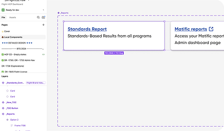
Mapping the source of truth
One key question asked during the interviews was: “Do you know where to find the single source of truth for UX patterns?” Below is a pie graph showing the quantitative results from the user interviews.

Neuron's honest, unbiased approach helped us see beyond our initial expectations. Their interviews revealed hidden blockers and helped align teams around what really needed support.

— Jay Brewer
Diving into the DesignOps Audit
Once we gained a qualitative understanding from the consumers of the design systems, we conducted a technical DesignOps audit, reviewing the design system universe, which consists of two core systems, as well as the related repositories and workflows across HMH’s ecosystem. This helped our team to uncover the primary opportunities and recommendations to close those gaps.

Workspace structure
Inconsistent file structures, naming conventions, and outdated project content made it difficult for teams to locate the source of truth, slowing down workflows.

File organization
Design files were bloated and difficult to navigate due to a lack of abstraction between tokens, assets, and components, hindering scalability.

Component construction
Components were deeply nested with inconsistent naming, hidden layers, and misused properties, causing confusion and performance problems.
Design system usage
Components were scattered, detached, or inconsistently linked across multiple files, and oversized components led to inefficiencies.

Variables setup
Over 500 variables were defined but often unused or inconsistently named. Non-standard naming and outdated color styles diluted integrity.

Documentation
Design principles, tokens, and typography were either missing or misplaced, reducing usability for both new and experienced users.
Bridging the gap between design and development
The DesignOps audit revealed deep fragmentation not only in design systems but also within the development infrastructure. While design teams struggled with duplicated patterns and inconsistent token usage, engineering faced operational bottlenecks of their own.
A significant finding was the reliance on a growing monorepo. Originally intended to streamline collaboration, it had become a source of friction by slowing performance, increasing cognitive load, and limiting modular growth. The design system lacked a scalable architecture to keep pace with the organization’s evolving complexity.
To address this, we recommended adopting a hybrid multi-repo structure combined with a unified DesignOps framework. This allowed HMH to modularize design and engineering assets while connecting them through a central source of truth--enabling shared libraries, synchronized tokens, and flexible team ownership.

Neuron's approach
Neuron established a federated design system framework composed of three interconnected layers: Foundation, Themes, and Product Libraries. This architecture unified HMH’s design principles and tokens across teams while still allowing for product-level customization.

The Foundation File is the central source for all variables and design tokens used across HMH.
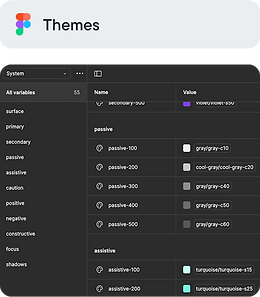
The Themes Library introduces scalable theming logic to support grade bands, branding, and accessibility needs.

Product Libraries are tailored libraries for each product that pull variables from the central Foundation and Themes layers.
There was a huge sense of relief, especially among design and engineering teams, to move beyond the old mindset of ‘just use what’s there,’ even when it wasn’t working.
Together we built a design system with grade-banding, theming, and other features that aligned with business goals across corporate, product, and sub-brand levels.
— Jay Brewer
Scaling with flexible variable management
Maintaining a living design system is one of the biggest challenges in achieving DesignOps excellence. That is where Neuron’s custom design-to-code variable manager, the Variable Sync Tool, comes in. It externalizes theming logic, provides a structured UI, and syncs changes directly to Figma via the REST API—perfect for scaling complex enterprise systems.

Bypass native Figma limitations
Variable Sync overcomes the 40-mode cap by externalizing theming logic.
Scale with clarity
It offers a structured UI that makes managing large token systems simple and reliable.
Syncing directly with Figma
All updates push directly to Figma through its native REST API, reducing manual effort and errors.
System-wide synchronization across design and development
To create a unified system, each library—Foundation, Themes, and Product—was connected to a centralized Master JSON repository to ensure token consistency across platforms.
Neuron implemented a scalable sync workflow that connected the Variable Sync tool, Figma, and Storybook. Tokens were managed visually in the Variable Editor, pushed to Figma via the REST API, and mirrored in Storybook for engineering use.
This end-to-end integration created synchronicity between the design and code, allowing teams to confidently work from a single source of truth without manual duplication or drift.

Scalability
We introduced features like theming and grade-banding, enabling teams to tailor the system for different educational levels.
Federated ownership
We helped define clear ownership roles to empower the right teams to maintain and evolve the unified design system.
Documentation
The design system balanced flexibility and consistency to support efficiency, asset reuse, and long-term growth.
Neuron worked without ego, integrated seamlessly with our team, and focused on real collaboration. This made all the difference when solving problems together.
— Jay Brewer
Key results
HMH's DesignOps initiative delivered measurable improvements across the organization, addressing core challenges and enabling teams to work more efficiently and confidently. Below are three of the most impactful outcomes from the collaboration:
Improved collaboration
Supporting ongoing rebranding efforts, the system’s clarity and user-friendly design have accelerated delivery timelines. Built-in theming and grade-banding have reduced manual work, enabling faster customization and consistent design across products.
Faster time to ship
One of the key business objectives we were faced with was to support the ongoing rebranding efforts. With the system’s clarity and user-friendly design, teams have accelerated their delivery timelines.
Built-in theming and grade-banding have minimized manual work, allowing for faster customization and more consistent design across products.
Accelerated onboarding
New teams and team members ramp up quickly and contribute with confidence thanks to a consistent design foundation and well-structured resources that provide clear guidance from day one.
It was incredible to see the development and design teams fully aligned. What used to be a fragmented process became a smoother, more connected way of working.
— Jay Brewer
