MOBILE & WEB APP UX/UI:
Givelify
Fundraising and charitable giving
Givelify is a platform used by nonprofits and places of worship to collect donations. Their web app is used by more than 70,000+ organizations looking to modernize and streamline their donor experience.
On the B2C side, their mobile app is used by hundreds of thousands of users who collectively donated over $1 billion in 2023 alone. Neuron collaborated with Givelify as an embedded design team. We worked to optimize the UX/UI of their mobile app and web app as well as elements of their product strategy.


Strategic partnership
When Givelify originally reached out to Neuron in 2019, they were looking for an experienced UX Agency to update designs produced by a low-cost overseas vendor.
The Client had discovered the prior designs were not high fidelity enough to be made usable by the internal engineering department.
In addition to building out the UX specs, Givelify needed a partner to help localize their mobile app and design new product illustrations.

Creating a design system
Having a robust, componentized design system was crucial for working concurrently with Givelify’s internal design team. This ensured the two teams could focus on different parts of the products without compromising cohesion.
The system’s consistency and comprehensiveness was also key in reducing engineering debt, and allowed the product team to quickly scale new feature improvements across all platforms.
A truly embedded UX team
The degree to which Neuron is embedded with the Client team varies from one project to another. Givelify wanted a strategic partner that could meaningfully participate in daily standups, roadmapping, and remain informed of everything happening within their product team.
Additionally, the Client wanted to work with Senior UX Designers who understood the needs and challenges that their audience faced. Givelify’s products—both consumer facing and B2B—are used primarily by an older generation. As such, the product team remains invested in delivering an equitable experience that is easy and intuitive for all users.


Creativity and strategy, while distributed
Communication is paramount in an embedded partnership, and we have had the opportunity to collaborate with nearly everybody across the organization through Slack and video sessions. An additional benefit of the embedded model is the frequency and quality of communication. We were available for design QA, releases, and quick fixes when the Givelify team needed us.
As a compliment to their team in-house, Givelify partnered with Neuron on complex UX design initiatives both to increase capacity and product capabilities. As the Givelify team continues to grow, we have seamlessly handed off some of the projects initiated by the Neuron team. Being embedded meant we were always available to answer questions as they came up.


Responding to changing priorities
As priorities change and needs expand or contract, we are able to pivot and meet these needs.
Too often, companies bring vendors in on a project-based engagement. This makes it very challenging for the teams to work in a truly agile way. The reality of most companies is that priorities inevitably shift. The benefit of an embedded team engagement is we can simply get to work.
In a fixed cost style project, scope needs to be updated and change orders have to be drawn up causing administrative burden.

Special projects: a live experience
One instance where we were able to make a quick pivot was to address a special live fundraiser for David Ortiz.
Tasked with designing an interactive “Giving Experience” intended for the live event. We created a design for this high-profile sports celebrity, which would invoke excitement and engagement around the act of giving.
Sign up flow - before
Improving B2B user onboarding
One of our most complex initiatives with Givelify was redesigning the B2B sign up experience. This is a key element within workplace applications that deal with elements of KYC, or "Know Your Customer".
The model we started with was similar to Yelp and Google MyBusiness, where organizations had to “claim” their profiles. Over time we continued to iterate and the most recent version included a wizard style flow to enable the process of onboarding.


Redesigned sign up flow

Streamlining integrations
While many businesses around the world use tools like Quickbooks or other bookkeeping software to gain insights into their accounting, places of worship use software called a Church Management System (ChMS).


A key goal of the Givelify B2B product is to provide a seamless flow of data from Givelify (which their parish uses to donate) and the ChMS that they use for management services.
That goal is achieved with the “Integrations” portion of the Analytics Studio web portal (B2B product). During our collaborative design of this section we had to take into account the desired flows and limitations for a number of disparate ChMS solutions.
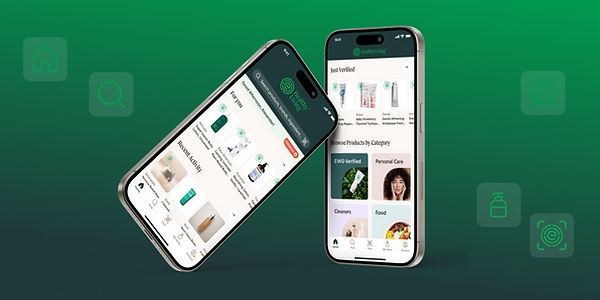
Redesigning the Android and iOS apps
Givelify’s mobile apps have hundreds of thousands of monthly active users, with an even split between Android and iOS; designing for Android was core to Givelify’s mission. We were cognizant of using UX patterns that would be expected by an Android user and created assets (e.g. AVD files) suitable for the Givelify development team.
We brought a similar approach to designing the iOS experience, the key consideration here was how to maintain a seamless experience between the iOS app and the device’s native web browser since transactions on iOS are completed outside the native app.


Web app improvements
The Browser Giving App was a popular option for organizations looking for a seamless transition from their own website to a giving experience. Our job was to bring the app up to par with the design system we had established for the mobile products.
Conclusion
Our unique multi-year partnership enabled Givelify to improve their products for their donees, donors and internal team, while making them more agile and responsive to the evolving needs of these groups.
We helped them to foster a user-centric design culture and product-driven approach.