RESPONSIVE WEB APP DESIGN & PRODUCT STRATEGY
PS
Luxury travel booking service
PS is a private terminal serving commercial flights at LAX. Their lounge experience is separate from the bustle of the main terminal and offers seamless security, customs clearance, and luxury amenities before and after each flight. Their web app is used not only by travelers but also by travel agents.
Due to high growth, PS wanted to improve their online experience. Together we prepared a design roadmap to improve their digital touchpoints, while making the PS experience richer and easier for their clientele.


Strategy, Planning, Audit, Research and Knowledge (SPARK) Guide
From the onset, PS knew they wanted to work with Neuron’s embedded team model. To kick this off we worked closely with PS over the course of four weeks for our SPARK phase; consisting of discovery, strategy and prioritization. This is where we set out to establish a strong understanding of their business, product, and the project goals. We worked collaboratively with product management, developers, and executives to define priorities, identify opportunities, evaluate competitors, comb through user stories, and audit existing wireframes. The outcome: a strategic design roadmap for the next two quarters.

Design System
PS had extensive brand guidelines created by a separate branding agency, but wanted to extend these print standards to their digital experience. The existing style guide didn’t fully account for the nuances of the web. Our embedded team worked with stakeholders and developers to build out a more robust design system, expanding on color, typography, and responsive grid. The new design system is more functional, consistent, and easy to use.


Digitalizing the booking experience
When PS launched in the spring of 2017, they forever transformed the airport experience. Their original means of getting from zero to MVP had the operations team managing a complex symphony of people, places, and times.
Neuron’s 2021 work on the booking experience helped to automate what was previously achieved manually, through multiple calls and emails with clientele/representation.
By documenting the key booking steps, together with the client team we were able to create a seamless web app experience. There users can select their preferred PS services, lessening the burden on the ops team.
Throughout the flow, we thoughtfully carved out moments to continually reinforce the PS mission of providing a fully-tailored luxury experience.

STEP 1
Flights
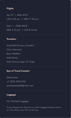
The core PS experience is based on the module of a travel itinerary. On this first step the user is entering flight details that were likely derived from a 3rd party booking site or travel agency.

STEP 2
Travelers
There are two primary user types: (1) individual travelers and (2) travel agents. For the latter, this page was particularly helpful by allowing the user to easily access the PII of prior-booked parties to make re-booking more streamlined.

STEP 3
Experiences
Whereas other pages of the booking app are restrained in their use of imagery and iconography, here on the experience selection a more editorial style layout was adopted which celebrates the beautiful interior design of the PS spaces.

STEP 4
Payment
Displaying myriad information clearly with a defined hierarchy is the goal of the payment summary page. Here the user gets a snapshot of expected costs, which are able to dynamical adjust based on membership type.

STEP 5
Customize
PS is much more than simply another beautiful airport lounge. White glove service is what sets them apart with unique perks like custom toy packages for children and other whimsical add-ons. Once the official payment processing is complete, the user will be able to select from a variety of optional add-ons to make their PS experience truly extraordinary.
Responsive design
The existing web app had been designed mobile-first to a fault, with a maximum content width of just 460 pixels regardless of device. What our research showed was that most PS users were interacting with the booking system on desktop, rather than a mobile, making it difficult to read and use, while wasting a lot of space on the margins. The updated grid system prioritizes legibility and ease of use across all device types.
Booking - Before


Booking - Redesigned
Booking Confirmation - Redesigned

Marketing website redesign
Starting with the booking tool first meant our team had a unique perspective and were already armed with the tacit information required to deliver on the marketing website as well. With the product UX/UI improved, the PS team then requested that Neuron create a website that could do justice to their new service offerings: The Salon, PS Direct, and the Private Suite.
While their development team focused on implementing our designs for the booking system, our embedded team worked with stakeholders on a website experience that utilized the updated design system and more clearly articulated the benefits of the service.


Booking Process - Experience Selection

Digital transformation
The PS product we were presented with did much of the heavy-lifting offline, with the staff members offering a truly white glove service over the phone and through email follow up. This way of interaction spoke very much to their v1 customer base. However it soon became apparent that the UX had to allow their growing user base to book online an a streamlined, self-service fashion. The process of digital transformation, led by a focused redesign of the web interface, has allowed PS to move away from manual operations and scale more effectively.


