How to Design B2B Marketing Software That Users Actually Want to Use

Updated: Oct 2
A guide to designing intuitive marketing software for B2B clients and users.

Marketing teams abandon software every day. Dashboards sit untouched, automation features gather digital dust, and attribution reports get ignored while marketers retreat to spreadsheets. B2B marketing software fails not because features are missing, but because design decisions prioritize checklists over how people actually work. Companies that invest in UX/UI design early build products that marketing teams genuinely adopt rather than work around.
TLDR, Key Takeaways:
Research-driven personas reveal actual workflow patterns and pain points that should shape every interface decision
Information architecture must balance data density with scannable layouts supporting quick decisions
Dashboard and automation design requires progressive disclosure that surfaces relevant features without overwhelming users
Attribution interfaces must translate data models into actionable insights marketers actually trust
Scalable design systems ensure consistency as features expand and teams grow
What Makes B2B Marketing Software Design Uniquely Challenging?
B2B marketing software serves users with wildly different technical abilities. The CMO reviews campaign performance between meetings. The marketing ops specialist builds automation sequences that run for months. The content marketer schedules social posts and tracks engagement. A single platform needs to accommodate all three without frustrating any of them.
This diversity creates tension that consumer apps never face. Instagram optimizes for one primary action. B2B marketing automation software must support dozens of workflows without making any feel secondary or buried.
The data complexity makes things harder. Marketing attribution software tracks customer interactions across channels, sessions, and time periods. Visualizing a six-month B2B buying journey with 47 touchpoints across 12 channels would make most dashboard designers nervous.
Successful B2B software marketing depends on creating interfaces that feel simple while handling sophisticated operations behind the scenes. That apparent simplicity requires deliberate design work at every level.
How Does Research Shape B2B Marketing Software Design?
Design decisions based on assumptions produce software that looks reasonable in demos but frustrates actual users. Product strategy consulting begins with learning who will use the product and what they need to accomplish. Starting with competitor feature lists leads nowhere useful.
Effective research for B2B marketing software targets three distinct user categories. Primary users interact daily and perform operational tasks like building email campaigns. Occasional users access specific features for quarterly reviews. Administrative users configure the system and manage integrations.
Mapping Real Workflows
Observing marketers in their actual work environment reveals patterns that interviews miss. A marketing manager at a SaaS company might keep three browser tabs open constantly, checking Salesforce for pipeline updates, flipping to their marketing platform for campaign metrics, then jumping to Google Analytics.
This research prevents designing for idealized workflows rather than messy reality. Marketing teams rarely follow linear processes.
How Should Information Architecture Handle Data Density?
B2B marketing software contains staggering amounts of information. Campaign performance metrics span months of history. Contact databases hold thousands of records. Automation sequences branch into complex decision trees. Users need access to all of it without getting lost.
Successful information architecture creates clear mental models that users internalize quickly. Marketo organizes around marketing activities like emails, landing pages, and programs. Drift structures everything around conversations and playbooks.
Consider organizing around user objectives rather than feature categories. An "Analyze Performance" section groups the tools a marketer needs when evaluating results, pulling together email metrics, campaign ROI, and funnel analysis, regardless of which technical system powers each feature.
Marketing platforms require both horizontal navigation between major functional areas and vertical drilling into specific data. Breadcrumb patterns help users track their location within deep hierarchies. Search becomes critical as content accumulates because nobody wants to click through seventeen folders looking for that webinar landing page from last quarter.
What Design Principles Apply to Marketing Dashboards?
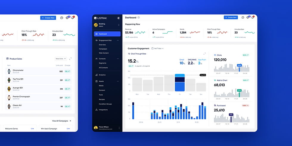
Dashboards represent the highest-stakes interface design challenge in B2B marketing software. Done well, they drive better decisions and faster action. Done poorly, they become noise that users ignore entirely. Professional UX/UI design services help teams avoid common dashboard mistakes.
Every metric displayed should connect to a decision someone might make. Vanity numbers that look impressive but don't inform action waste screen space. Before adding any dashboard element, ask who needs this information and what they'll do differently based on what they see.
Progressive disclosure prevents overwhelm. Lead with the metrics most users need most frequently. Place secondary data one click away rather than competing for primary real estate.
Visual Hierarchy and Scannability
Marketers often check dashboards during meetings, between tasks, or while juggling multiple priorities. The interface should communicate status at a glance before users focus on details.
Color coding communicates trends instantly. Green signals positive movement. Red flags concern. But this only works when used sparingly and consistently. When everything screams for attention, nothing receives it.
White space reduces cognitive load and prevents the "wall of numbers" effect. Crowded layouts might display more data, but users absorb less of it.
How Do You Design Intuitive Automation Workflows?
B2B marketing automation software lives or dies by its workflow builder. These interfaces ask non-technical users to create conditional logic, define triggers, and orchestrate multi-step sequences.

Visual workflow builders have become standard because they map to how people naturally think about sequences. Seeing the flow from trigger through conditions to actions makes abstract logic tangible. Customer.io uses a clean left-to-right flow that even first-time users grasp quickly. But many implementations still confuse users through poor visual language.
Every element in an automation builder should be immediately identifiable by function. Triggers look different from conditions, which look different from actions. Listrak uses distinct colors and shapes for each element type. Users internalize this visual vocabulary quickly.
A well-designed workflow builder needs these visual distinctions:
Triggers use a distinct shape and color that signal "this starts the sequence"
Conditions appear as branching decision points with clear yes/no paths
Actions show what happens at each step, with icons representing email, SMS, or CRM updates
Delays display timing visually so users grasp pacing at a glance
Exit points mark where contacts leave the workflow and why
Error Prevention and Testing
The consequences of automation errors extend beyond the platform itself. Wrong emails get sent to thousands of contacts. Customer experiences break in visible, embarrassing ways.
Smart defaults reduce configuration errors significantly. When a user creates an email action, pre-populate reasonable send settings. Klaviyo highlights incomplete steps in red and prevents activation until issues are resolved.
Testing capabilities built directly into the workflow builder let marketers verify behavior before activation.
What Makes Attribution Interfaces Trustworthy?
B2B marketing attribution software attempts to answer questions that lack definitive answers. Which touchpoints influenced a deal? How should credit be distributed across a months-long buying journey? Users quickly develop skepticism toward data they don't understand.
Transparency becomes the design imperative. Every metric should link to its underlying data and methodology. When a dashboard shows that content marketing influenced 40% of the pipeline, users need access to the specific deals included and the model applied. Bizible lets users drill into any attribution number and see exactly how it was calculated.
Model comparison features help users develop informed perspectives. First-touch attribution tells a different story than multi-touch or time-decay models. CaliberMind displays multiple models simultaneously so users can triangulate insights.
Attribution Model | How It Works | Best For | Limitation |
First-Touch | 100% credit to initial interaction | Measuring awareness channels | Ignores nurturing touchpoints |
Last-Touch | 100% credit to the final interaction | Tracking conversion drivers | Overlooks top-of-funnel impact |
Linear | Equal credit across all touchpoints | Simple multi-touch reporting | Treats all interactions as equal |
Time-Decay | More credit to recent touchpoints | Long sales cycles | May undervalue early engagement |
Position-Based | 40% first, 40% last, 20% middle | Balanced view of the buyer journey | Arbitrary weighting assumptions |
Visualizing Customer Journeys
Individual journey visualizations bring attribution data to life. Dreamdata shows the actual path a converted account took with every page visit, email open, and event attendance mapped on a timeline.
Timeline-based representations from first touch to conversion let users scan patterns quickly. Color coding by channel and sizing by engagement intensity add information density without extra clicks.
How Do Integrations Affect User Experience?
B2B software marketing strategies increasingly depend on connected ecosystems rather than standalone tools. Marketing platforms integrate with Salesforce, Google Ads, LinkedIn Campaign Manager, and dozens of other services. Each integration creates design implications that extend beyond initial setup.
Integration configuration interfaces often suffer from technical overexposure. Users encounter API terminology, OAuth authentication flows, and field mapping tables that assume developer familiarity. Zapier changed this space entirely by abstracting complexity through wizard-based setup flows. No API documentation required.
Once connected, integrated data should blend naturally into the primary interface. Users never think about where the information originated because visual continuity makes everything feel unified.
Managing Connection Health
Integrations break. API versions change. Authentication tokens expire. The interface must communicate connection status clearly without becoming an alarm system.
Health indicators at the integration level show overall status without requiring users to check connections individually. Segment uses a simple green, yellow, red system. When a Salesforce sync fails, the error message should explain what went wrong and offer next steps.
How Do You Scale Design Consistency?
Maintaining design quality becomes increasingly difficult as B2B marketing software expands. New features ship weekly. Additional designers join the team. Faster development cycles create pressure to skip reviews. Each of these factors creates opportunities for inconsistency that erodes user experience over time.
DesignOps services establish the systems and processes that preserve design integrity at scale. Component libraries ensure that buttons, forms, modals, and navigation elements behave identically throughout the product.
Design tokens take consistency deeper than visual properties. Spacing systems and interaction patterns defined at the token level ripple automatically through implementations.
Governance Without Bureaucracy
Designate pattern owners responsible for specific component categories. These individuals review proposed additions and document approved variations.
Regular audits catch inconsistencies early. Quarterly reviews comparing implemented interfaces against documented patterns prevent drift before it compounds.
The Competitive Edge Nobody Talks About
The marketing software market keeps adding features while ignoring why existing ones go unused. Companies racing to match competitor feature lists miss the real opportunity. Becoming the tool marketers actually open first each morning matters more than checkbox parity with alternatives.
Ready to create B2B marketing software that marketing teams genuinely want to use? Our research-driven approach aligns every design decision with user needs and business objectives. Contact our team to discuss how strategic UX/UI implementation can differentiate your product.
FAQs
How long does it take to design a B2B marketing software interface from scratch?
Timeline depends heavily on scope and complexity. A focused MVP might require 3-4 months of design work. Enterprise platforms typically need 6-12 months for thorough design across all major workflows.
Should we prioritize mobile interfaces for B2B marketing software?
Most B2B marketing software usage happens on desktop, but mobile access matters for monitoring. Prioritize desktop experiences while ensuring critical features like checking campaign status and viewing key metrics work well on mobile.
How do you balance power-user needs with approachability for occasional users?
Progressive disclosure handles this tension well. Default views prioritize common tasks and surface-level data. Advanced capabilities remain accessible but don't clutter primary interfaces. Consider separate views or modes for users with different expertise levels.
What research methods work best for B2B marketing software design?
Contextual inquiry works best because observing users in their actual work environment reveals workflow patterns that interviews miss. Combine observation with card sorting for navigation design and usability testing for interface validation.
How often should B2B software companies update their interface design?
Avoid major redesigns that force users to relearn familiar patterns. Continuous incremental improvement works better than periodic overhauls. Reserve significant changes for moments when user research reveals clear problems worth the transition cost.
About Us
Neuron is a San Francisco–based UX/UI design agency specializing in product strategy, user experience design, and DesignOps consulting. We help enterprises elevate digital products and streamline processes.
With nearly a decade of experience in SaaS, healthcare, AI, finance, and logistics, we partner with businesses to improve functionality, usability, and execution, crafting solutions that drive growth, enhance efficiency, and deliver lasting value.
Want to learn more about what we do or how we approach UX design? Reach out to our team or browse our knowledge base for UX/UI tips.