MOBILE APP UX/UI DESIGN
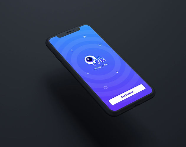
In the Know
Using design to help people learn
In The Know is an iOS mobile application that helps native Chinese speakers learn English. By recognizing and designing for the cultural differences, In The Know offers a learning experience that improves language comprehension for users. In addition to improving their English, users gain access to a community and an opportunity to learn by discovery.


.png)
A mobile app that brings language learning into the real world
Neuron worked with In the Know to take their concept, list of desired features, and low-fidelity mockups to then design, build, launch, and submit an iOS application in the App Store. To support the iOS application, we also created their brand identity and design language, designed an architectural guide, and produced a marketing website and explainer video.

Organizing logic
The app’s central organizing logic groups content in “scenarios”—words, phrases, descriptions, and Q&A. We brought this life with a feature that gave users the ability to highlight and save words or phrases they came across for later review. For example, encountering and then highlighting the phrase “ordering coffee” could become a starting point for learning.
Encouraging exploration
Within every scenario and explanation, there are other loosely-connected scenarios to choose from, which drives engagement and continues the learning. For those who wanted more structure and less spontaneity or learning by discovery, they could choose scenarios from a structured list.

Practical, real-time learning
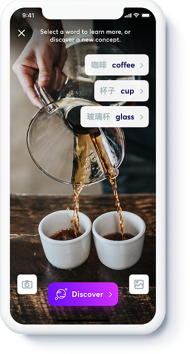
We helped the client identify that focusing purely on common daily situations and objects out in the world was just one way to provide value. For learning in real life situations, users could also capture words or phrases with their iPhone camera and view English or Chinese translations, through the implementation of image recognition and communication with the In the Know content database.
The experience of opening the camera feature, taking a photo, and in a matter of seconds receiving not only translations but a way to dive in and learn more was an integral feature and a moment of “magic" in the experience.
The users could follow many paths to access the learning content, from the bulletin board, the scenarios tab, or their camera.
Scenarios
Once on a scenario page, users are served detailed explanations of real-world scenarios with associated words and phrases, in a more intuitive reading format custom-made for native Chinese speakers. The scenarios pages are designed to help build a better understanding of sentence structure, concepts, and vocabulary in context.
We created swipeable pages to declutter and break content down into steps. By reducing distractions within each scenario we were able to increase comprehension. At the end of each explanation, a user could swipe to the next explanation or the scenario. We created a sense of continuity by displaying these other, related modules at the end of each scenario.

Listen
User can hear how to properly pronounce useful or interesting English words, with a tap.

Highlight
Users can save words, phrases, and snippets of text from the scenarios to come back to.

Review
Users can go back to saved words and phrases to help commit them to memory.


Users guide their learning
By offering a robust Review tab within the app, we gave users a place to save and toggle between words and explanations, which are organized along a visual timeline based on when they were added. Having the option to return to saved content helped with learning and retention.
We made design choices that would help users visualize their progress, while encouraging them to continue. We achieved this by introducing a Profile tab that showed all of the material they had already covered.

A product that will evolve with its users
An app is just one of many touchpoints and a great product is never really “done.” With the minimum viable product released and available for download, the client can focus on listening, gathering market feedback from beta users, accumulating data, and determining how to prioritize feature improvements.


